Tag Archives: #projectreclaim

2014

Reflecting on 2014, a couple of themes:

  • Reclaim. In the past, I’ve written about taking back technologies from corporate entities. This year, I’ve found myself embarking on what I consider to be the natural extension of Project Reclaim: taking back my attention from technologies. In April I ditched my smartphone, and in September I stopped using Twitter. Each decision arose from a desire to devote more of my limited mental and emotional energies on things that matter most to me, like my family and my work. In each case, the pull of inertia was strong – the natural thing was to continue using the tools, just like everyone else around me was doing – but in each case, the rewards of letting go have been significant.
  • Ease. My wife and I decided over dinner tonight that 2014 felt easy. We didn’t move this year. We enjoyed satisfying jobs and financial stability. Our son transitioned from a toddler to a very nice little boy. In contrast, our family has a number of very large changes coming in 2015, changes that will be hard in many ways. So the relative and welcome easiness of 2014 is worth a moment’s pause.
  • ShippingDuring 2014, BuddyPress shipped a number of major versions. I put a huge amount of time into BP 2.0, as both a developer and a release manager, and I think it paid off – IMHO it’s one of the most important releases in BuddyPress history. BuddyPress 2.2 will come in the first weeks of 2015, and it too promises to be a really important release. In addition, I was invited to join the WordPress core team for the 4.1 release, an experience that’s been fulfilling in its own way. Considered alongside a number of successful client project launches, I’ve been involved in a happily large number of solid software releases this year.

A big year ahead, but for now, за ваше здоровье!

Doom and gloom upon the offing of Google Reader

This week, Google announced that it’s shutting down Reader. This is the first of Google’s “sunsets” that hits me personally – Reader has been a crucial part of my internet use for the better part of a decade. I happen to think, like Marco Arment, that in the long run the loss of Google Reader will probably be good for innovation in RSS readers and for RSS in general. Google’s hamstrung app has been just good enough for people like me, but non-approachable for non-geeks. A year from now, I’m hoping that there’ll be many more quality players. So, in the long run, I’m reasonably optimistic.

More immediately, though, a couple of causes for concern:

  1. Finding an alternative to Reader. My RSS reading habits are too ingrained for me to abandon them, even for a short time. More than that: following RSS feeds is beyond mere habit, but is check on my intellectual honesty. I follow many blogs whose authors I frequently disagree with, or even dislike. (Contrast this with Twitter, where I’m pretty fickle about whom I follow, and how many tweets/links I pay attention to.) So RSS is, for me, a partial antidote to the echo chamber tendency. That means that I’ve got to find a new app, and migrate over, and I’ve got to do it quickly.

    There have been a number of posts over the last couple days listing Reader alternatives. A number of them are cloud/service based, and for practical reasons (such as, um, Google Reader) as well as philosophical reasons (see below), I’m only considering alternative tools that I can run either locally or on my own server. A couple that spring to mind:

    • Fever. I’m interested in this one because (a) the screenshots make it look nice, and (b) it comes highly recommended by people I respect, like D’Arcy Norman. I like that it’s self-hosted. I don’t like the fact that its sustainability model is to charge for downloads. It’s not that I don’t think the author shouldn’t be paid – I would be happy to pay $30 or $300 for a great RSS reader app. It’s that the success of the single-developer model is contingent on the willingness of that developer to keep working on the project (paid or otherwise). I’m far more comfortable with software that is community developed under a free license, ideally using a set of technologies that would allow me to modify or even adopt the project if the main devs were to abandon it.
    • Tiny Tiny RSS. tt-rss also comes recommended by someone I respect (Mika Epstein, in this case). And it’s community-developed, which I like. It doesn’t look as pretty as Fever, but aesthetics are about fourth or fifth on my list of requirements.
    • PressForward. As Aram describes, the PF team (of which I’m pleased to be a member) is working on a WordPress-based tool that, among other things, does RSS aggregation and provides some feed-reading capabilities. PressForward is really designed for a different kind of use case – where groups of editors work together to pare down large amounts of feed data into smaller publications – but it could be finagled to be a simple feed reader. Mobile support is a particular pain point, as 50% or more of my RSS intake is done on my phone, and PF has nothing in place to make this possible at the present time. So, PressForward may not be quite ready for primetime, but I do think that it has promise.
  2. Get the hell off of Google. We all know that Google is a company with shareholders and profit goals to meet. Yet we often act like Google is some sort of ambient benevolent force on the web. Since I started Project Reclaim, I’ve been working on extricating myself and my data from the clutches of Google (among other corporate entities). Reader’s demise is a wake-up call that the time for dilly-dallying is over.

    For my own part, I still use a few Google services besides Reader:

    • Gmail. I don’t use Gmail primarily anymore, though many people do still email me at my gmail.com address, so obviously I have it open and I check it frequently.
    • Picasa. I use the Picasa desktop app on OSX to export photos from my cameras and organize/tag them. I also use Picasa Web Albums as one of my many photo backup services. (Seriously – I back up my photos to no fewer than six different local and cloud services. Nothing is more important or irreplaceable than my family photos.)
    • Drive/Docs. Aside from the occasional one-off collaborations, I use Drive to maintain a number of spreadsheets and other documents that I share with members of my family, etc.
    • Calendar. I’m not a heavy calendar user, but when I do use a calendar, I like Google because of its integration with my Android phone.
    • Chromium. Not Chrome, but still largely Google-reliant, Chromium is not my main browser, but I use it daily for doing various sorts of development testing.
    • Android. This is maybe the one that steams me the most, because at the moment there are no truly free alternatives. (Firefox OS, please hurry up.)

    In some of these cases, there are easy ways to get off of the Google services. In others, it’ll be a challenge to find alternatives that provide the same functionality. In any case, the Reader slaughter is a harsh reminder that Project Reclaim has stagnated too long with respect to Google services.

    More than myself, I’m worried about others – those who aren’t as technically inclined as I am, or those who simply don’t care as much as I do. Google’s made it pretty clear (as is their right, I guess) that they’re not an ambient benevolence. Those who rely on Google then, especially for critical services like email, should take this warning very seriously. Please consider carefully what you’re doing when you make yourself wholly dependent on the whim’s of Google’s product managers, and consider options that are either free-as-in-speech, or services that you pay for in a traditional way.

Project Reclaim update

Back in March 2011, I kicked off the Project Reclaim project. Since then, others have picked up where I’ve left off – most notably, Doug Belshaw and D’Arcy Norman (who have surpassed me both in the reclaiming and in the blogging about the reclaiming). Behind my radio silence, though, has been a flurry of recent reclaiming activity:

  • I’m mostly de-Mac-ified. I recently bought a Samsung Series 9, which is serving as a stopgap full-time machine until I have the time to set up a desktop Linux rig. On day one, I wiped the Windows 7 installation and installed Arch Linux. It took some time to get set up, and I’m still using my Mac for a couple of things (Picasa, Skype, the old Adobe AIR Tweetdeck), but I’m almost totally moved over. I may write a post or two in the upcoming weeks about specific parts of the transition – there were some pain points, to be sure, especially in the initial setup. But, in general, it’s been smoother, easier, and more pleasurable than I would have guessed. Using Linux full time makes me feel like I’m back in the driver’s seat of my computing life, and it feels extra good to know that 95% of the software on my full-time machine is non-proprietary.
  • At the same time that I moved to Linux, I also switched to Vim. I’d been a user of BBEdit, which is a really great piece of software, but moving away from the Mac meant I had to choose something else. So I figured I’d go for the powerhouse of all text editors. Vim has a certain allure. When I was younger, I studied jazz piano. I remember watching my instructor play and being driven nearly to tears: I understood, in broad strokes, what he was doing and why it sounded the way it did, but it crushed me that I couldn’t translate that knowledge into the same kind of performance magic that he could. I feel much the same way about Vim masters. I’m far from a master, but I’m getting much much more fluent. Also, of course, Vim is non-proprietary, and it gives me major geek cred. So, big win all around. I should note that the Vim transition has actually been far more difficult than the Linux transition, and it was only after about four or five weeks of full-time use that I started to feel like I was back to my pre-switch level of productivity. (In this sense, it was a lot like switching from QWERTY to Dvorak.)

The big proprietary services and software products left in my life are Dropbox and Twitter. Moving away from Dropbox is fairly simple – see D’Arcy’s great posts on his experiments with Owncloud – I’ve just been lazy about it. Twitter is far more complicated, both technically and socially, as well as far more pressing, given Twitter’s recent NBCishness. So that’s the next mountain to climb.

How many others have been Reclaiming over the last year or two? Would love to see more projects along the lines of D’Arcy’s and Doug’s.

2011

A bunch of stuff happened in 2011.

Like 2010, 2011 was a year of transitions for me: in my relationship with academia, in the way I earn a living, in the way I present myself as a citizen-builder of the internet. Being a parent is the biggest transition of all, forcing me to put into perspective the ways I spend my energy and the ways in which I define myself and what has value to me. (This transition has been overwhelmingly a Good Thing.) Continuing to strive for the right balance in these areas will, I’m sure, be a hallmark of my 2012. (Thankfully, I have no plans to have a child or get married in 2012. A man needs a year off from major life events!)

Happy new year!

Moving my photo site to a new URL and server

This post is pretty much just a note to self (I tend to have to relearn how to write Apache rewrites every time I use them), but I thought it might be useful to others as well.

A few months ago I set up a Twitpic-esque WordPress site for hosting my mobile photos. Since then, the shared hosting space where the sites lives has been filling up, so I don’t have much storage left, and I’ve also gotten a sweet new domain name. So this morning I took a few minutes to move the existing WordPress site (http://boonebgorges.com/photos/, part of a WP network at boonebgorges.com) and to https://boone.gorg.es/photos/, on another server. Here’s how I did it:

  • Use the WP export tool (Dashboard > Tools > Export) to get an XML of the old site data (on boonebgorges.com/photos)
  • Create a new, empty site (boone.gorg.es/photos)
  • Import the content of the old site (Dashboard > Tools > Import > WordPress)
  • Move my custom theme (and its parent theme) to the new server, and activate it for the new site
  • To make sure that old links to boonebgorges.com/photos/* are redirected properly, put the following in .htaccess on the old server:
    [code]
    # These two lines have to be somewhere near the top of your .htaccess
    RewriteEngine On
    RewriteBase /

    # Redirect old photo URLs
    RewriteCond %{HTTP_HOST} ^boonebgorges.com$ [NC]
    RewriteCond %{REQUEST_URI} photos/*
    RewriteRule ^.*$ https://boone.gorg.es%{REQUEST_URI} [R=301,L]
    [/code]

Because the main purpose of this site is to post from my mobile phone, I also had to change the settings in my WordPress Android app. It doesn’t look like this app allows you to change the URL of an existing site, so I just deleted the one I already had on the phone and added the new one, being sure to enable XML-RPC access first, at Dashboard > Settings > Writing.

Project Reclaim and the email dilemma

One of the main 2011 goals for Project Reclaim is to get my email out of Gmail. Heavy reliance on Gmail raises a number of red flags. For one thing, email is central to my business and personal life online, and provides the best archive of my online past (get the important stuff first). For another, Gmail is ad-supported, in a way that has rankled since Gmail went public: it “reads” your email and serves ads based on what it finds. No one really talks about it anymore, but it still kind of bugs me – so I want to move to a non-free system (paying is better than getting something for free).

It’s taken me a while to make the move, though, for two main reasons.

  1. Email is tricky. Good, free mail server software is easy to find. But it’s not necessarily easy to set up and maintain. If the outgoing server isn’t configured correctly, your messages will get marked as spam. If you haven’t got constantly monitored spam filters on your incoming mail, you’ll be inundated with garbage. And the issues of backups and reliability, while certainly important in the case of (say) self-hosted websites, are many times more important with email: if the server goes down, emails may get altogether lost in the ether.

    I’ve set up and configured email servers before, and it hasn’t been very fun. When deciding how to solve the Gmail conundrum, I needed to take this fact into consideration. I started to do a bit of research on paid email hosting, and found good reviews of Rackspace’s hosted email service. The service is pretty affordable, and I knew from years of Slicehost use (now owned by Rackspace) that customer service and support would be good.

  2. I needed a good address. I own a lot of domain names, but most of them are lame, and none lent themselves very neatly to an email address. For instance, when your domain name is boonebgorges.com, what’s the email account name? ‘boone’? The cool factor there is pretty low. And I am a cool guy, so that’s important.

    Some of the obvious domains are taken. boone.com is wasted on dry-erase boards. gorges.com could never be wrested from the clutches of “one of the oldest family owned Volvo franchises in the United States”. But there was hope – or should I say había esperanza – that I might get the fairly unused gorg.es. In fact, my brother and I had been working on that project for a couple of years, but it was only a few months ago that the owner finally relented, and the domain name was transferred to the Gorges boys.

So, about two months ago, I made the switch. For now, I just set it up as another account in Thunderbird (more on my Thunderbird setup). I created a generic “Archive” directory on my gorg.es account (to mimic Gmail’s All Mail) and pointed my ‘Y’ shortcut to that directory. I’m using K-9 Mail on my Android phone, which I set up to save the entire Archive directory, so I’d have good local email search on my phone. Little by little, I’m moving over my email correspondence to the new, awesome address. Bye bye, Gmail!

Done with Apple

In my 2010 year-in-review post I made a passing mention to my decision not to buy any more Apple products. Most people who know me can probably guess the reasons behind the decision, but recently I’ve had some discussions that made me think that it’s worth a blog post to spell them out.

First is my ongoing project to move away from proprietary software in general. All things being equal, it’s better to use software whose source code I can view and modify; even if, in fact, I never do these things, the fact that I could is a kind of safeguard against a number of frequent aspects of closed-source software: data lock-in, data rot, restrictions on hardware compatibility, secret surveillance, etc. As the operating system is in many ways the foundation of all other tasks I do on a computer, so it is of fundamental importance to use an open OS.

Second. I believe in the Web as an open platform for communication and expression, and Apple is increasingly anti-web.

You often hear hoopla about how digital technologies can radically democratize and transform x (fill in your favorite x: scholarship, education, publication, politics, etc). The success or failure of these transformations is tied up with the Web’s openness as a platform: open standards like TCP/IP, enablers of decentralization like distributed DNS, free software like Linux and Apache to run servers. Putting any of these technical details under the control of a single agent, especially a corporate agent that answers only to shareholders, threatens to limit free expression and disenfranchise vulnerable groups of potential users. If a robust, widely-used, open Web is important to the future of equality and democracy, and if such a Web can only be defended by keeping out proprietary interests, then it’s important to fight against interference from those interests.

I take it as fairly obvious that Apple (and not only Apple, though they seem to be the trendsetters) is anti-Web. Consider their distribution models. iTunes makes it so that you have to buy apps, music, and movies through an application, rather than through web pages. Know that annoying “feature” where, when you click on an iPhone app link on the web, you get a page informing you that you’ve clicked on an iTunes link, whereupon iTunes proceeds to open? That’s anti-web. The increasing focus on “apps” is a more troubling anti-web move. As was nicely illustrated by an article I read a while back (can’t find the link), you can spend a whole day doing stuff on an iPad – using Twitter, Facebook, WordPress, Yelp, email, Google Maps, etc – without ever viewing a web page (though they all use web services that use HTTP as a transport). In this way, Apple is doing an end run around the web.

The nature of the end run is particularly troubling. Apple is the arbiter of the software that runs on its devices (completely, in the case of iThings; increasingly, in the case of the AppStorified Mac). This creates unnecessary bottlenecks when it comes to bugfix or security releases. It creates a single point of failure for apps and therefore for devices; if Apple goes under tomorrow (or, more likely, changes their mind completely about whatever they please), how will you continue to update your apps? Worst, it puts Apple in the position of policing for content, which, whether driven by a well-intentioned desire to avoid offensive content or by a malevolent puritanism, is a Bad Thing.

Anyway, all of these points have been made over and over again, by many different people. My own bottom line: I believe in the value of the open web to such an extent that I’ve devoted my career to it. Thus, it feels wrong to keep using, and indirectly encouraging the use of, technologies like Apple’s. That goes especially for iOS and its devices, the area where I think the threat to the web is worst. But it extends to the Mac as well. Even if you maintain that the Mac will never merge into iOS (a position I find disingenuous), there’s no question that spending money on Mac hardware is a way of indirectly feeding the beast. Next time I buy a laptop, I’ll be sad not to be getting a pretty MacBook, but, on balance, I feel more comfortable giving my money to a hardware manufacturer that’s less pernicious.

For what it’s worth, I don’t think that mine is a decision that everyone must, or even should, make. Using Apple products brings pleasure to a lot of people, even people who largely share my ideologies about the free web. It’s perfectly legitimate to decide that the benefits you get from using those products outweigh the downsides. But, for me, it’s past the tipping point, which is why I’m done buying Apple products.

I develop free software because of CUNY and Blackboard

For two reasons, Blackboard is the key to why I develop free software.

The first reason is historical. I first got into free software development because of my work with the CUNY Academic Commons project. As spearheaded by Matt Gold, George Otte and others, the Commons is intended to create a space, using free software like WordPress and MediaWiki for members of the huge community of the City University of New York to discover each other and work together. The project is not pitched as a Blackboard alternative, for a number of reasons (primary among which is that the Commons’s Terms of Service prohibit undergraduate courses from being held on the site). Still, the Commons was conceived, at least in part, out of frustration about the near lack of collaborative tools and spaces in CUNY. And more than anything else, Blackboard (by which I mean Blackboard Learn, the proprietary learning management software that has been CUNY’s official courseware for quite a few years) is the embodiment of what can be so frustrating about academic technology at CUNY: central management, inflexibility, clunkiness, anti-openness. In this way, Blackboard begat the CUNY Academic Commons, and the CUNY Academic Commons begat Boone the developer.

There is another reason why Blackboard is integral to my free software development. It is ideological.

Short version: I love CUNY and I love public education. Blackboard is a parasite on both. Writing free software is the best way I know to disrupt the awful relationship between companies like Blackboard and vulnerable populations like CUNY undergraduates.

Here’s the longer version. I’ve been affiliated with CUNY in a number of capacities over the last decade: PhD student, adjunct lecturer, graduate fellow, full-time instructional technologist, external contractor. I’ve seen many parts of CUNY from many different points of view. Like so many others who have philandered their way through CUNY’s incestuous HR departments, my experience has rendered a decidedly love/hate attitude toward the institution. You can get a taste of the what CUNY hate looks like by glancing at something like @CUNYfail. The love runs deeper. Those fortunate enough to have “gotten around” at CUNY can attest to the richness of its varied campus cultures. In every office and every department on every campus, you’ll meet people who are innovating and striving to get their work done, in spite of a bureaucracy that sometimes feels designed to thwart.

And the students. CUNY is the City University of New York, the City University. It belongs to New York, and its history is tied up with the ideals of free education for New York’s residents. While the last few decades have seen the institution (as a whole, as well as a collection of campuses) evolve away from these ideals in various official and unofficial ways, it’s impossible to step into a CUNY classroom without getting a sense that CUNY still serves as a steward for New York’s future. CUNY is too huge and its population too varied to make general statements about the student body, but I’ll say anecdotally that, of all the universities I’ve been associated with, none even approach the level of racial, economic, and academic diversity that you find on a single campus, to say nothing of the system as a whole. CUNY is (to use a lame but apt cliché) a cross-section of New York: her first-generation Americans, her first-generation college students, her rich and her poor, her advantaged and her vulnerable. (See also Jim Groom’s I Bleed CUNY, which makes a similar point with a lot less abandon.)

Public education is a public trust, maybe the most important equalizer a state can provide for its citizens. CUNY, with the population of New York City as its public, could demonstrate the full potential of public education in a more complete and visible way than perhaps any other public university. It’s for this reason that it breaks my heart and boils my blood to see CUNY money – which is to say, student tuition and fees – poured into a piece of software like Blackboard.

In virtue of their age, undergraduates are inherently a vulnerable population, and CUNY undergraduates – reflecting as they do the full demographic spectrum of New York City itself – are doubly vulnerable. Many CUNY undergraduates go to CUNY because if they didn’t, they wouldn’t go to college at all. This imposes certain moral strictures on those responsible for managing and spending the money paid by CUNY students in tuition and fees. Wasting CUNY money is a far worse crime than wasting, say, shareholder money in a private company. Shareholders have freedom; if they don’t like your management, they vote with their feet/wallets/brokers. CUNY students, by and large, do not have the same freedom; it’s safe to say that, for most CUNY students most students, big-ticket NYU and Ivy Columbia are not reasonable alternatives. CUNY students are, in this sense, captive, which means that their hard-earned tuition money is captive as well. Thus it is a very bad thing to spend that money on things that aren’t worth it.

And Blackboard is not worth it. Vats of digital ink have been spilled expounding Blackboard’s turdiness, and this is no place to rehash all the arguments in depth. A short list, off the top of my head:

  • The software is expensive [EDIT 9-21-2011: See this post for more details on cost]
  • It’s extremely unpleasant to use.
  • It forces, and reinforces, an entirely teacher-centric pedagogical model.
  • It attempts to do the work of dozens of applications, and as a result does all of them poorly.
  • Blackboard data is stored in proprietary formats, with no easy export features built in, which creates a sort of Hotel California of educational materials
  • The very concept of a “learning management system” may itself be wrongheaded.
  • As recently reported, the software may be insecure, a fact that the company may have willingly ignored.
  • Blackboard’s business practices are monopolistic, litigious, and borgish

In short, Blackboard sucks. Blackboard supporters might claim that some, or even most, of the criticisms leveled above are false, or that they apply equally to other web software. Maybe. And I certainly don’t mean to downplay the difficulty of creating or assembling a suite of software that does well what Blackboard does poorly. But the argument against spending student money on something like Blackboard goes beyond a simple tally of weaknesses and strengths. As Jim Groom and others have argued for years, shelling out for Blackboard means sending money to a big company with no vested interest in the purposes of the institution, which in the case of CUNY is nothing less than the stewardship of New York City’s future, while the alternative is to divert money away from software licenses and into people who will actually support an environment of learning on our campuses. Frankly, even if Blackboard were a perfect piece of software, and even if its licensing and hosting fees were half of what it costs to hire full-time instructional technologists, programmers, and the like to support local instances of free software; even if these things were true, Blackboard would still be the wrong choice, because it perverts the goals of the university by putting tools and corporations before people. The fact that Blackboard is so expensive and so shitty just makes the case against it that much stronger.

As long as our IT departments are dominated by Microsoft-trained technicians and corporate-owned CIOs, perhaps the best way to advance the cause – the cause of justice in the way that student money is spent – is to create viable alternatives to Blackboard and its ilk, alternatives that are free (as in speech) and cheap (as in beer). This, more than anything else, is why I develop free software, the idea that I might play a role in creating the viable alternatives. In the end, it’s not just about Blackboard, of course. The case of Blackboard and CUNY is a particularly problematic example of a broader phenomenon, where vulnerable populations are controlled through proprietary software. Examples abound: Facebook, Apple, Google. (See also my Project Reclaim.) The case of Blackboard and its contracts with public institutions like CUNY is just one instance of these exploitative relationships, but it’s the instance that hits home the most for me, because CUNY is such a part of me, and because the exploitation is, in this case, so severe and so terrible.

On average, I spend about half of my working week doing unpaid work for the free software community. Every once in a while, I get discouraged: by unreasonable feedback, by systematic inertia, by community dramas, by my own limitations as a developer, and so on. In those moments, I think about CUNY, and I think about Blackboard, and I feel the fire burn again. For that, I say to CUNY (which I love) and Blackboard (which I hate): Thanks for making me into a free software developer.

Building a baby photo site with WordPress

My wife and I just had our first baby, which is the occassion for much nachas and, by extension, picture sharing. Facebook is, for better or for worse (emphasis on the latter), the de facto place for such sharing to happen. For a number of reasons – a desire to be somewhat selective about who sees my family pictures, my Project Reclaim sensibilities, the fact that I don’t have a Facebook account and generally think that Facebook is an evil company – I don’t want to use FB for this purpose. As in the case of my Twitpic-like photoblog, I figured I could use WordPress to set something up that was nearly as seamless as Facebook, or Google+, or Flickr, or whatever.

The criteria

There were a few things I wanted out of the baby site.

  1. Easy (or zero) login for users
  2. Control over who has access
  3. Optional email notification for new content
  4. Easy, javascripty gallery browsing

When I started, I was pretty sure that I’d be able to get all of these things pretty easily, using existing WordPress plugins. I was both right and wrong about this: plugins exist for all of these purposes, but none of them were very easy to implement. As a result, I ended up building several pieces from scratch. I’ll go through each of the criteria, talk a bit more about what I was looking for, and then say something about how it was achieved. By doing this, and sharing the code (spoiler alert: https://github.com/boonebgorges/Hard-G/tree/master/wp-content), I’m hoping that I can help others with similar sensibilities to get started on their own sites.

Non-sucky registration and login

I love WordPress, and I understand the important reasoning behind the decisions that led to the design, but WP’s user registration system sucks. I didn’t want just anyone to be able to create and activate an account. I didn’t want users to have to click an activation link. I didn’t want users to have randomly generated passwords that would need changing later on. And I wanted users to have the option of logging in a non-WP way.

Several of these problems could be solved by using Facebook logins. I’m not willing to give my photos over to the horrific FB leviathan, but I’m happy to piggyback on their login APIs if it will save my family and friends a few headaches. I wanted my users to have the option of clicking a single button that would give my site the ability to provision them based on their persistent Facebook login.

I started by looking at some popular Facebook Connect plugins from the wordpress.org plugin repository. I didn’t really like them. Most were linked to the Comments section of blog posts, while I wanted to use the logins for overall site access. Most were dependent on Javascript for logins, while I wanted to handle logins on the server side. Most used an outdated version of FB’s API (or at least of the PHP API classes that FB offers). And, to be blunt, most were too much of a mess, having been retrofitted many times over, and as a result next to impossible to extend. I tried modifying one or two of the more popular FB-WP plugins to do what I wanted, but I ended up writing so much garbage spaghetti code that I decided to cut my losses and start from scratch.

So I boned up a bit on the FB API, and wrote a small plugin that I call Wally Login. Together with the registration page template from my custom theme (a child of TwentyEleven), it does a couple of key things.

Your choice

Your choice

  • Rudimentary access control · If a non-logged-in user tries to visit any page on the site (other than the registration page), he is redirected to the Register page.
  • FB login integration · If a user clicks the “Log me in using Facebook” link, they’re directed to the FB authorization page for my website (which is registered as a Facebook app). There, they’re asked to approve the app – a one-time process – and are then returned to my site. Based on the display name, email address, etc that I get from FB, I create a WP user corresponding to the FB account. On future visits, approved users who are logged into Facebook will be automatically logged into my WP site whenever they visit it (an important point, because FB cookies are persistent over browser sessions, while WP logins, by default, are not). As a result, in the best-case scenario, a user will authorize their FB account with my site one time, and will never again have to think about authorization on Wally’s page.
  • A customized WP registration process · If users opt not to go the FB route, they can create a WP account directly on the site. I wanted to avoid sending users to an unthemed wp-login.php or wp-signup.php page, so I cribbed a few lines of code from BuddyPress and made my own registration and login dialogs. Wally’s site is part of a larger WP network, but I wanted to bypass WPMS’s built-in registration stuff (which requires users to activate their accounts, and is thus generally too hard for newbies to grok). My custom registration therefore creates the user directly (with wp_insert_user()), using a password that he provides, and skips the activation email. (By bypassing account activation, I’m removing an important spam prevention tool. More on that in the next section.)
  • Customized email notifications · Because I’m not using the built-in registration process, I needed to write my own email notifications for account applications and approvals.

If you decide to use my code, keep in mind that it’s not particulary beautiful. I wrote it for my own use, which means that it will take a bit of elbow grease to get it to work on your own site. In particular, if I were writing something for more general distribution, I would not be so reliant on a theme template as I am here. But if you’re looking to create a site like mine, this code is a great place to start – especially the FB integration stuff, which has made the registration and login process about as smooth as it can get.

Access control

The final important thing that the Wally Login plugin does is to provide me (the site admin) with control over who has access to the site. There are a couple ways I could have approached this issue. One is to whitelist users ahead of time. The problem with this is that I’m bound to forget some names, get email addresses wrong, and run into other problems that stem from my unfortunate lack of omniscience. Another strategy is the invitation code. When unique to the individual, this method suffers from the same drawbacks of the whitelist; when non-unique (ie when everyone uses the same invitation code) it takes away much of the security, as the code can be passed around quite easily; either way, invitation codes are clunky, easily misplaced, and all too often mistyped.

Thanks for applying

Thanks for applying

As a result, I ended up going with a third option: an application and approval process. Here’s the idea, conceptually. Anyone who wants can create an account on my site (either through Facebook or natively; see the previous section). However, the account does not actually allow access to the site unless the account is also approved by the administrators. Thus, after the initial application, two emails are sent: one to the applicant saying “thanks for applying, please be patient”, and one to me saying “there’s a new applicant, please approve them”. Then I go to my approval interface and click the Approve button (if I want), which marks the user as approved in my database and sends them an email saying “You’re in!”

Here’s a brief description of how it works technically. All applicants have a WP account created for them. Every new account is marked, at the time of creation, with user_status = ‘2’, and I make sure that no page other than Register can be viewed by an account with user_status = ‘2’. In this way, I am turning the idea of activation around a bit – natively, WP makes the user do the activation, but in my case I do it. The admin tool I use to activate users is my Unconfirmed plugin, designed for a slightly different purpose but quite at home here. (For technical reasons, Unconfirmed needs users to have activation keys; thus Wally Login also generates some dummy keys during the user creation process so that Unconfirmed will work right.) Unconfirmed, in turn, does the work of flipping user_status to 0 upon approval.

Taken together, Wally Login and Unconfirmed (with custom WP registration, FB integration, user approval by admin, etc) has given me a comfortable level of access control, without making the process unduly difficult for my users.

Email notification for new content

One of the biggest drawbacks of creating a standalone picture site instead of using an all-purpose social network (in practice, this means Facebook) is that the standalone site is likely to be forgotten. FB collects all of your network’s activity into a single stream; it’s highly unlikely, on the other hand, that Wally’s site will become part of anyone’s daily routine, so that they stop by to check for new content. For that reason, good email notification of new content is essential to making the site work.

Dead simple email subscription

Dead simple email subscription

I first tried using the popular Subscribe2 to handle these notifications. But I ran into a bunch of problems. For one thing, I didn’t like that S2’s subscription management happened in the Dashboard – I want to keep my users on the front end. S2’s category-based subscription is too complicated for my site, where people are either going to want to subscribe to all posts or to none at all. And the widget that comes with S2, for display on the front-end of the site, is pretty much atrocious. (Sorry. The rest of the plugin is nice. But that widget sucks.) At first I tried solving these problems just by building my own widget for S2, one that would tell the user whether he was currently subscribed, and show an Unsubscribe/Subscribe button, as appropriate. But, given the structure of S2’s data (which is somewhat arcane, and in any case far too complicated for my purposes), it ended up being a lot harder than it should have been.

So – wait for it – I wrote something from scratch. It is dead simple. Two parts: (1) a widget, which does exactly what I describe in the foregoing paragraph; and (2) hooks into publish_post to send an email to all subscribed users (along with some gentle checks to make sure dupes are not sent). This plugin has no admin UI and no options, because I don’t need any of those things.

Pretty galleries

Since the main point of the site would be to look at lots of pictures, it was quite important to have an easy, pretty way to do so. By “easy” I mean, primarily, navigable by keyboard; by “pretty”, I mean, primarily, bigger than the content area of a typical blog post. Less important, but still desirable, was the admin interface: I wanted it to be easy to upload lots of pictures at once, to add captions and other metadata if necessary, and to turn it all into a gallery that would look good on the front end.

Pretty, easy

Pretty, easy

You know the drill: I tried a couple of the more popular free plugins, but all of them were annoying in one way or another, and each one was way overengineered for my meager needs. I was especially disappointed by the back-end admin for the popular gallery plugins, which I found lugubrious, unintuitive, and impossible to extend. After some consideration, I decided that I actually preferred WP’s native Add Media interface for uploading photos and adding metadata, and that I was perfectly happy with the way that WP’s gallery shortcode displayed content on the front end, at least when viewing thumbnails.

So the only thing I really needed was to implement the javascript that would allow for keyboard navigation and lightboxing of gallery photos. Thanks in part to his extremely uncreative and literal plugin naming schema, I found Viper007Bond’s jQuery Lightbox For Native Galleries plugin. It does almost exactly what I want, right out of the box.

I did make a few minor mods, though. First, the plugin is a bit greedy in the way that it filters the output of get_attachment_link(), which was either breaking things (as in the case of comment_post_redirect on attachment posts) or making it hard to display links to the attachment page instead of the raw attachment file. The former problem I solved with a filter; for the latter problem, I was a bit lazy, so I modded the plugin itself in addition to adding an explicit ‘lightbox’ class to attachment links. This combination of hacks makes it work perfectly for my purposes.

Odds and ends
A little bonus

A little bonus

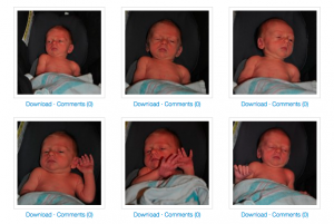
With my absolute requirements met, I was able to add a few other goodies to the site. My theme is a child of Twenty Eleven, which I’m pretty much using as-is. But I’ve added a few fun bits. First, on each attachment page, I added Download links, so that users could download images of various resolutions for printing or editing. I messed with the WP Admin Bar so that users coming from Facebook wouldn’t see Log Out and some other inappropriate links. And under each thumbnail in Gallery view, I’ve added Download/Comments links, so that users could bypass the jQuery lightbox and go straight to the attachment permalink if they wanted.

It took some work, but I think I’ve ended up with a site that is nice to use and easy to maintain, without resorting to the extreme discomfort associated with Facebook. Hooray!

BuddyPress and the YOURLS: WordPress to Twitter plugin

A few weeks ago, I wrote about reclaiming short URLs using YOURLS. That post raised some interest among the CUNY Academic Commons team in having a URL shortener just for the Commons, with full integration into BuddyPress. So I emailed Ozh Richard, author of YOURLS, about the possibility of adding BuddyPress support to his official YOURLS WordPress plugin, YOURLS: WordPress to Twitter. He graciously accepted my offer to do the leg work.

Today I’m releasing the fruits of this collaboration: version 1.5 of YOURLS: WordPress to Twitter. YWTT 1.5 automatically detects when you’re running BuddyPress, and adds the following BP-specific features:

  • Member and Group URLs – Generate short URLs for member profiles and for group home pages.
  • A “pretty URL” setting – Instead of generating random URLs (like http://blo.so/54), you can make member and/or group members ‘pretty’ (like http://blo.so/username or http://blo.so/groupname).
  • User customizability – Optionally, you can add new options under groups’ Admin > Group Settings and members’ Settings > Short URL allowing users to request a custom short URL of their choice. (This feature requires that you set YOURLS_UNIQUE_URLS to false in your YOURLS configuration file.)

Down the road, I plan to flesh out BP-YOURLS functionality, with optional short URLs for forum topics, activity items, and so on.

I’ve also slipped full localization support into version 1.5. Send me your mo/po translation files if you’d like them to be distributed with the plugin.

Download YOURLS: WordPress to Twitter 1.5, with BP support.