Monthly Archives: July 2011

WordPress for credit: Conceptualizing and justifying a WP course

A few months ago, I was contacted by Kathryn Weinstein, a local graphic designer and member of the graphic design faculty at Queens College, about co-teaching a WordPress course, for credit toward the Graphic Design degree, in the fall of 2011. Immediately, I felt drawn to the prospect of revisiting my old haunting grounds. But more than that, I was convinced that such a class had potential to benefit students in a few important ways. So I agreed to the project, and Kathryn and I have been planning, off and on, since then.

While the first goal of this fall’s course – titled “WordPress: Beyond the Basics” – is, of course, to serve its enrolled students, Kathryn and I have agreed that we also want our experience to serve as a sort of experiment for future courses, at QC and beyond. In that vein, I’ll be writing occasionally, both here on my personal blog and on our course site, about the process of planning and executing the course. This post will focus on how we’re conceiving and justifying the class, in very broad terms.

What would a WordPress course look like?

The course objectives, in the current draft of our syllabus, look like this:

  1. to strengthen web-building skills
  2. to explore the relationship between content, design and organization
  3. to gain familiarity with standards and best practices in the industry

This suggests a multi-layered approach to the course. On one level (roughly corresponding to the second objective in our list), it’ll be what I take to be typical of a graphic design curriculum. The first and third objectives, which will involve getting our hands dirty with some real coding, call for more justification. A few thoughts:

  • As anyone knows who’s ever tried to hire someone to do web work, or land such a gig himself, the term “web designer” has a wide variety of accepted uses. Sometimes it’s used in the strict sense, where the designer delivers comps that are, in turn, implemented by more “technical” folks. Sometimes a “web designer” is a front-end specialist, doing the creative work and the implementation, often at the same time. Sometimes “web designer” means “coder of web stuff”. Most often, the “designer” is the jack-of-all-trades, knowing enough about each stage of the idea-through-implementation process to be able to make it happen. By learning something substantial about web technologies, students will make themselves fit a greater variety of these definitions. That, in turn, means more job opportunities after graduation.
  • Even if the designer never touches a CSS declaration after semester’s end, it’s unquestionably beneficial to have at least a rough understanding of how the Web’s underlying technologies work. How many web professionals have been frustrated by site mockups, created by “pure” designers, that are impractical or impossible to translate into markup? More importantly, how many hours and dollars have been wasted in this way? Much of this frustration can be avoided if the relevant parties share a common grasp on some key concepts: the CSS box model; the distinction between client- and server-side processing; progressive enhancement; etc.
  • As some of my friends in the digital humanities have argued, there is a general, humanistic argument for learning about how the web works. For one thing, the Web is the medium through which so much of our communication happens – and, by extension, the medium in which our conceptions of others and ourselves are formed. Working with some of the tools that make the Web work is a way of engaging critically with the medium, thereby arriving at a richer understanding of our relationship with it, and how it affects our relationship with the world. On a related note, writing code – whether on the Web or not – is a mode of inquiry that is (arguably) fundamentally different from more traditional academic modes, and (definitely) different enough to make it epistemologically worthwhile. (This last bit is nicely summed up, appropriately enough, by WordPress co-founder Matt Mullenweg’s pithy “scripting is the new literacy”.) Some of us would like to see these kinds of priorities spread throughout the curriculum; this class can serve as a testing ground.

On balance, I see these considerations as a pretty solid justification for the academic value of a course like the one we’re considering.

Why WordPress?

If it’s not too much of a stretch to justify a graphic design course on designing for the web – and, as you might gather from my previous musings, I don’t think it’s a stretch at all – you may still wonder why it makes sense to focus on WordPress.

There are a few reasons. First is a conviction, shared by Kathryn and me, that diving into a complex platform like WordPress will ultimately make for a more engaging and valuable experience than a more staged, “Hello World”-style introduction to web technologies. It’s true that many of our students will never have seen so much as a line of HTML, and it may be true that our job would be easier if we waded in the shallows instead of diving headfirst into WordPress’s morass of HTML, CSS, PHP, MySQL, JavaScript…. But I – a Seasoned Web Professional – didn’t learn about the web that way. I learned by jumping into a complex system, and figuring my way out.

The architecture of WordPress makes this kind of learning easy. Take WP themes. I’ve often heard friends (who were much smarter than me, by the way) complain about the fact that WP’s theming system involves the on-the-fly interpretation of raw PHP – a recipe for security and aesthetic disasters if there ever was one. But this feature/bug also makes the themes readable, and thus hackable. The fact that WP is written largely in procedural PHP means that you can follow its thread of reasoning, change a line of code, and see the changes with a simple browser refresh. No compilation; no MVC framework; no class dependencies. One might argue that these features of WP make it less robust or sophisticated, but they almost certainly lower the bar for the n00b.

Moreover, WordPress is really, really widely used. Starting with WP will give students a sense of what it’s like to develop a website in the actual world. More than that – facility with WP development is something that a budding designer can put on her resumé, and it will actually mean something to those who read it.

From an ideological point of view, I’m a fan of the fact that we’ll be able to build an entire class on totally free technologies. From the LAMP stack, to WordPress, to Firefox and Firebug, we’ll be developing with tools that are free-as-in-beer and free-as-in-speech. That’s good for students in several ways. It means that they won’t have to plop down for expensive licenses. And it means that lessons about data ownership and free software philosophy can come along for the ride.

More to come

In an upcoming post, I’ll be talking in more detail about what we plan to cover in the course. It’s still very much a work in progress – and will be right up through the beginning of the semester, as we won’t know until then about our students’ backgrounds – but I plan to use this space to workshop some ideas. Feedback welcome!

Building a baby photo site with WordPress

My wife and I just had our first baby, which is the occassion for much nachas and, by extension, picture sharing. Facebook is, for better or for worse (emphasis on the latter), the de facto place for such sharing to happen. For a number of reasons – a desire to be somewhat selective about who sees my family pictures, my Project Reclaim sensibilities, the fact that I don’t have a Facebook account and generally think that Facebook is an evil company – I don’t want to use FB for this purpose. As in the case of my Twitpic-like photoblog, I figured I could use WordPress to set something up that was nearly as seamless as Facebook, or Google+, or Flickr, or whatever.

The criteria

There were a few things I wanted out of the baby site.

  1. Easy (or zero) login for users
  2. Control over who has access
  3. Optional email notification for new content
  4. Easy, javascripty gallery browsing

When I started, I was pretty sure that I’d be able to get all of these things pretty easily, using existing WordPress plugins. I was both right and wrong about this: plugins exist for all of these purposes, but none of them were very easy to implement. As a result, I ended up building several pieces from scratch. I’ll go through each of the criteria, talk a bit more about what I was looking for, and then say something about how it was achieved. By doing this, and sharing the code (spoiler alert: https://github.com/boonebgorges/Hard-G/tree/master/wp-content), I’m hoping that I can help others with similar sensibilities to get started on their own sites.

Non-sucky registration and login

I love WordPress, and I understand the important reasoning behind the decisions that led to the design, but WP’s user registration system sucks. I didn’t want just anyone to be able to create and activate an account. I didn’t want users to have to click an activation link. I didn’t want users to have randomly generated passwords that would need changing later on. And I wanted users to have the option of logging in a non-WP way.

Several of these problems could be solved by using Facebook logins. I’m not willing to give my photos over to the horrific FB leviathan, but I’m happy to piggyback on their login APIs if it will save my family and friends a few headaches. I wanted my users to have the option of clicking a single button that would give my site the ability to provision them based on their persistent Facebook login.

I started by looking at some popular Facebook Connect plugins from the wordpress.org plugin repository. I didn’t really like them. Most were linked to the Comments section of blog posts, while I wanted to use the logins for overall site access. Most were dependent on Javascript for logins, while I wanted to handle logins on the server side. Most used an outdated version of FB’s API (or at least of the PHP API classes that FB offers). And, to be blunt, most were too much of a mess, having been retrofitted many times over, and as a result next to impossible to extend. I tried modifying one or two of the more popular FB-WP plugins to do what I wanted, but I ended up writing so much garbage spaghetti code that I decided to cut my losses and start from scratch.

So I boned up a bit on the FB API, and wrote a small plugin that I call Wally Login. Together with the registration page template from my custom theme (a child of TwentyEleven), it does a couple of key things.

Your choice

Your choice

  • Rudimentary access control · If a non-logged-in user tries to visit any page on the site (other than the registration page), he is redirected to the Register page.
  • FB login integration · If a user clicks the “Log me in using Facebook” link, they’re directed to the FB authorization page for my website (which is registered as a Facebook app). There, they’re asked to approve the app – a one-time process – and are then returned to my site. Based on the display name, email address, etc that I get from FB, I create a WP user corresponding to the FB account. On future visits, approved users who are logged into Facebook will be automatically logged into my WP site whenever they visit it (an important point, because FB cookies are persistent over browser sessions, while WP logins, by default, are not). As a result, in the best-case scenario, a user will authorize their FB account with my site one time, and will never again have to think about authorization on Wally’s page.
  • A customized WP registration process · If users opt not to go the FB route, they can create a WP account directly on the site. I wanted to avoid sending users to an unthemed wp-login.php or wp-signup.php page, so I cribbed a few lines of code from BuddyPress and made my own registration and login dialogs. Wally’s site is part of a larger WP network, but I wanted to bypass WPMS’s built-in registration stuff (which requires users to activate their accounts, and is thus generally too hard for newbies to grok). My custom registration therefore creates the user directly (with wp_insert_user()), using a password that he provides, and skips the activation email. (By bypassing account activation, I’m removing an important spam prevention tool. More on that in the next section.)
  • Customized email notifications · Because I’m not using the built-in registration process, I needed to write my own email notifications for account applications and approvals.

If you decide to use my code, keep in mind that it’s not particulary beautiful. I wrote it for my own use, which means that it will take a bit of elbow grease to get it to work on your own site. In particular, if I were writing something for more general distribution, I would not be so reliant on a theme template as I am here. But if you’re looking to create a site like mine, this code is a great place to start – especially the FB integration stuff, which has made the registration and login process about as smooth as it can get.

Access control

The final important thing that the Wally Login plugin does is to provide me (the site admin) with control over who has access to the site. There are a couple ways I could have approached this issue. One is to whitelist users ahead of time. The problem with this is that I’m bound to forget some names, get email addresses wrong, and run into other problems that stem from my unfortunate lack of omniscience. Another strategy is the invitation code. When unique to the individual, this method suffers from the same drawbacks of the whitelist; when non-unique (ie when everyone uses the same invitation code) it takes away much of the security, as the code can be passed around quite easily; either way, invitation codes are clunky, easily misplaced, and all too often mistyped.

Thanks for applying

Thanks for applying

As a result, I ended up going with a third option: an application and approval process. Here’s the idea, conceptually. Anyone who wants can create an account on my site (either through Facebook or natively; see the previous section). However, the account does not actually allow access to the site unless the account is also approved by the administrators. Thus, after the initial application, two emails are sent: one to the applicant saying “thanks for applying, please be patient”, and one to me saying “there’s a new applicant, please approve them”. Then I go to my approval interface and click the Approve button (if I want), which marks the user as approved in my database and sends them an email saying “You’re in!”

Here’s a brief description of how it works technically. All applicants have a WP account created for them. Every new account is marked, at the time of creation, with user_status = ‘2’, and I make sure that no page other than Register can be viewed by an account with user_status = ‘2’. In this way, I am turning the idea of activation around a bit – natively, WP makes the user do the activation, but in my case I do it. The admin tool I use to activate users is my Unconfirmed plugin, designed for a slightly different purpose but quite at home here. (For technical reasons, Unconfirmed needs users to have activation keys; thus Wally Login also generates some dummy keys during the user creation process so that Unconfirmed will work right.) Unconfirmed, in turn, does the work of flipping user_status to 0 upon approval.

Taken together, Wally Login and Unconfirmed (with custom WP registration, FB integration, user approval by admin, etc) has given me a comfortable level of access control, without making the process unduly difficult for my users.

Email notification for new content

One of the biggest drawbacks of creating a standalone picture site instead of using an all-purpose social network (in practice, this means Facebook) is that the standalone site is likely to be forgotten. FB collects all of your network’s activity into a single stream; it’s highly unlikely, on the other hand, that Wally’s site will become part of anyone’s daily routine, so that they stop by to check for new content. For that reason, good email notification of new content is essential to making the site work.

Dead simple email subscription

Dead simple email subscription

I first tried using the popular Subscribe2 to handle these notifications. But I ran into a bunch of problems. For one thing, I didn’t like that S2’s subscription management happened in the Dashboard – I want to keep my users on the front end. S2’s category-based subscription is too complicated for my site, where people are either going to want to subscribe to all posts or to none at all. And the widget that comes with S2, for display on the front-end of the site, is pretty much atrocious. (Sorry. The rest of the plugin is nice. But that widget sucks.) At first I tried solving these problems just by building my own widget for S2, one that would tell the user whether he was currently subscribed, and show an Unsubscribe/Subscribe button, as appropriate. But, given the structure of S2’s data (which is somewhat arcane, and in any case far too complicated for my purposes), it ended up being a lot harder than it should have been.

So – wait for it – I wrote something from scratch. It is dead simple. Two parts: (1) a widget, which does exactly what I describe in the foregoing paragraph; and (2) hooks into publish_post to send an email to all subscribed users (along with some gentle checks to make sure dupes are not sent). This plugin has no admin UI and no options, because I don’t need any of those things.

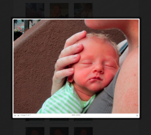
Pretty galleries

Since the main point of the site would be to look at lots of pictures, it was quite important to have an easy, pretty way to do so. By “easy” I mean, primarily, navigable by keyboard; by “pretty”, I mean, primarily, bigger than the content area of a typical blog post. Less important, but still desirable, was the admin interface: I wanted it to be easy to upload lots of pictures at once, to add captions and other metadata if necessary, and to turn it all into a gallery that would look good on the front end.

Pretty, easy

Pretty, easy

You know the drill: I tried a couple of the more popular free plugins, but all of them were annoying in one way or another, and each one was way overengineered for my meager needs. I was especially disappointed by the back-end admin for the popular gallery plugins, which I found lugubrious, unintuitive, and impossible to extend. After some consideration, I decided that I actually preferred WP’s native Add Media interface for uploading photos and adding metadata, and that I was perfectly happy with the way that WP’s gallery shortcode displayed content on the front end, at least when viewing thumbnails.

So the only thing I really needed was to implement the javascript that would allow for keyboard navigation and lightboxing of gallery photos. Thanks in part to his extremely uncreative and literal plugin naming schema, I found Viper007Bond’s jQuery Lightbox For Native Galleries plugin. It does almost exactly what I want, right out of the box.

I did make a few minor mods, though. First, the plugin is a bit greedy in the way that it filters the output of get_attachment_link(), which was either breaking things (as in the case of comment_post_redirect on attachment posts) or making it hard to display links to the attachment page instead of the raw attachment file. The former problem I solved with a filter; for the latter problem, I was a bit lazy, so I modded the plugin itself in addition to adding an explicit ‘lightbox’ class to attachment links. This combination of hacks makes it work perfectly for my purposes.

Odds and ends

A little bonus

A little bonus

With my absolute requirements met, I was able to add a few other goodies to the site. My theme is a child of Twenty Eleven, which I’m pretty much using as-is. But I’ve added a few fun bits. First, on each attachment page, I added Download links, so that users could download images of various resolutions for printing or editing. I messed with the WP Admin Bar so that users coming from Facebook wouldn’t see Log Out and some other inappropriate links. And under each thumbnail in Gallery view, I’ve added Download/Comments links, so that users could bypass the jQuery lightbox and go straight to the attachment permalink if they wanted.

It took some work, but I think I’ve ended up with a site that is nice to use and easy to maintain, without resorting to the extreme discomfort associated with Facebook. Hooray!

Unconfirmed 1.2: non-Network support; delete options

I’ve just tagged version 1.2 of Unconfirmed, my WordPress plugin that allows for easy management of unactivated registrations on your WP site.

Unconfirmed 1.2 has two new, handy features:

  • WordPress non-Network support Previous version of Unconfirmed supported only WP Multisite (Network mode). That made sense, because WP “single” does not have native support for user activation in the same way that MS does. However, BuddyPress, when run on WP “single”, apes Multisite’s activation functions, and in those cases, it makes sense to use Unconfirmed. Version 1.2 introduces support for this kind of setup.
  • A “delete” option A lot of people have asked for a “delete” button, which would allow admins to delete unactivated registrations altogether (usually used in case of spam registrations). In Unconfirmed 1.2, those wishes have been granted. The new version allows you to delete spam registrations, one at a time or in bulk.

Download Unconfirmed from the wordpress.org repo, and follow development at https://github.com/boonebgorges/unconfirmed.